Project Settings
The Project Settings section defines the foundational behavior and structure of a Newsfeed project. These settings determine:
what types of content are available (e.g., news, events, pages),
how and where content is delivered (web, launcher, or in-game),
which languages are supported,
how content appears and behaves in the editor,
how content is previewed and secured before publication.
In addition, this section allows you to configure themes, metadata structure, reusable content blocks, and integration hooks for external systems. These settings shape the editing environment, publishing workflow, and output format, and are typically adjusted before content creation begins.
Use this section to configure core project capabilities before authors begin working with content.
General
The project settings available in the General tab:
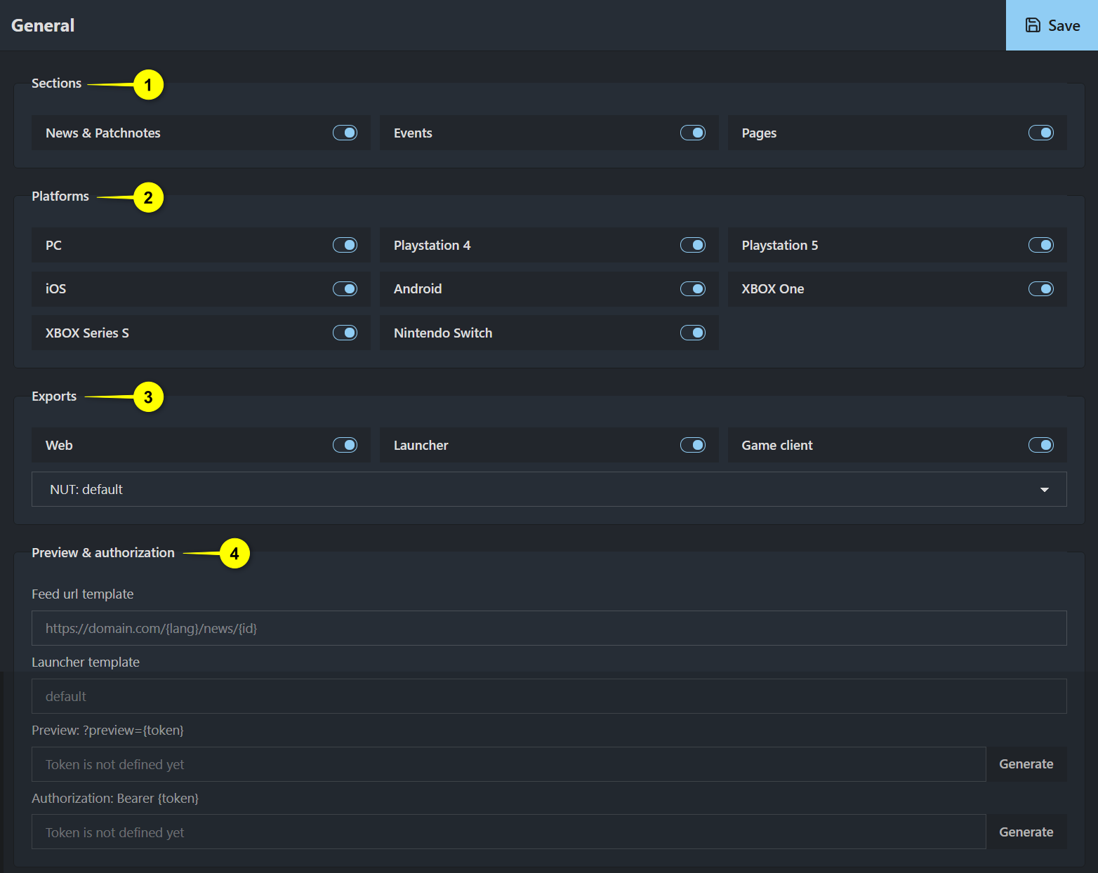
1 Sections: Types of content enabled in the project.
2 Platforms: Supported target platforms.
3 Exports: Export targets and APIs.
4 Preview & Authorization: How unpublished content is previewed and secured.
Sections
Toggle the types of content available in the project:
News & Patch notes: Enables standard news items, including patch notes.
Events: Enables support for time-based or thematic events.
Pages: Enables standalone content pages not tied to specific dates.
When enabled and saved, these sections appear in the left navigation sidebar.
Platforms
Select the game platforms your content should support. These are used for both filtering and targeting during content creation:
PC
PlayStation 4
PlayStation 5
iOS
Android
XBOX One
XBOX Series S
Nintendo Switch
Toggles activate or deactivate platform visibility in the interface.
Exports
Enable the client types (APIs) your content is intended for. These APIs determine how the content is exported and consumed by various clients.
Web: Exports content to a web-based API, typically used by websites. This API provides detailed access to all project entities: News, Events, and Pages.
Launcher: Generates a static HTML page with the latest news list. This is typically used in game launchers that embed a simple news feed.
Game client: Exports content in a format optimized for in-game rendering. Currently supports News and Pages. This API uses a specialized structure to ensure compatibility and performance inside the game client.
When Game client is enabled, an additional dropdown appears: NUT is a profile defining how content is structured for specific client types. Available options include:
default: Standard export format.enlisted: Custom format used by the Enlisted game client.
Note
The list of NUT profiles will be expanded over time as new clients and formats are introduced.
Locales
The Locales section defines the set of languages supported by your project and how they behave across different interfaces, including the site, launcher, or in-game client. Use this section to activate core content locales, set fallback logic, and define optional aliases that redirect users of unsupported locales to available language versions.
The numbered elements in the image below correspond to the following sections:
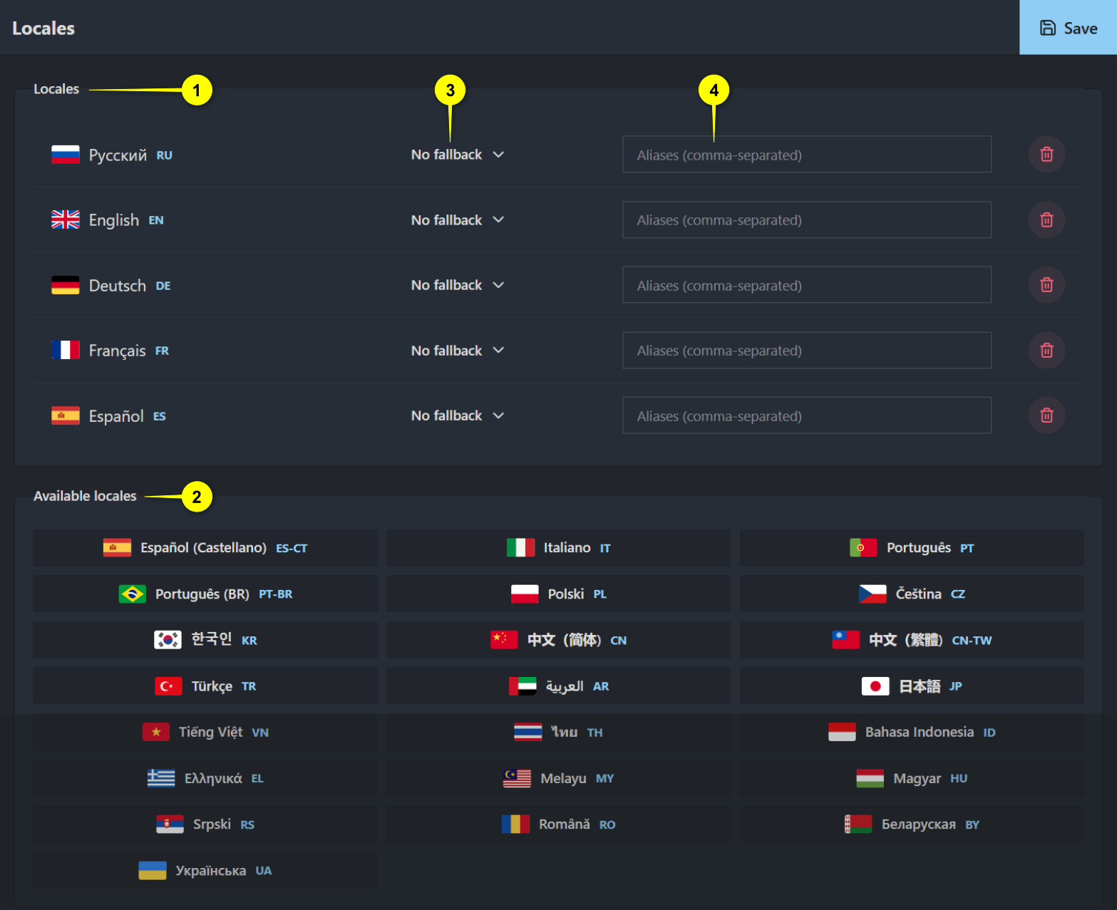
1 Locales: Displays all active locales in the project. These are the languages in which primary or partial content is authored and delivered. You can configure 3 fallbacks and 4 aliases per locale, or remove a locale from the active list using the Delete button.
2 Available Locales: A full list of supported languages. Select any locale to move it to the active list.
Locales
Locales in this section define which languages are actively used for content. They generally fall into two types based on usage:
Primary locales: These are the main languages for content creation. Each piece of content (such as a news item or a page) is authored separately for each primary locale.
Secondary locales: Used in specific cases, such as one-time campaigns or partial translations. These locales may not require full coverage across all content.
For each enabled locale, you can view and configure the following:
Language & Code: The display name and ISO code of the locale (e.g.,
English (EN)).Fallback: Optional. If content is missing in this locale, the service will show it from the fallback language instead.
Aliases: Optional. Specifies which client languages will use this locale’s content if they don’t have their own (e.g.,
de,fr).Delete button: Removes the locale from the list of active ones. This doesn’t delete existing content but hides the locale from the UI and APIs.
Available Locales
The bottom panel lists all supported locales that can be added to the project. To activate a locale, select it from the Available Locales list.
Fallback
Fallbacks define which language should be used when content is missing in the selected locale.
For example, if you don’t prepare full content in Portuguese, but still want
Portuguese users to access the site, you can enable Português (BR) as a locale
and assign English as its fallback:

In practice, if a Portuguese user visits a page that hasn’t been localized, the service will show the English version instead.
Aliases
Aliases are used to remap one locale to another when content is not created directly for the original language. This is especially useful for game clients that support multiple UI languages but only receive localized content in a subset of them.
For example, if the client supports English, German, and French, but content is only authored in English, you can assign German and French as aliases to the English locale:

This way, users with German or French game client settings will still see content, served from the English version.
Important
If a language is set as an alias for another locale, you won’t be able to create content specifically for it. To add custom content in that language, include it as a standalone locale and set a fallback instead.
Make sure to click Save after making any changes to apply them.
Editor
The settings available in the Editor tab define how the content editor (Gaijin Editor) behaves and which components are available during content creation.
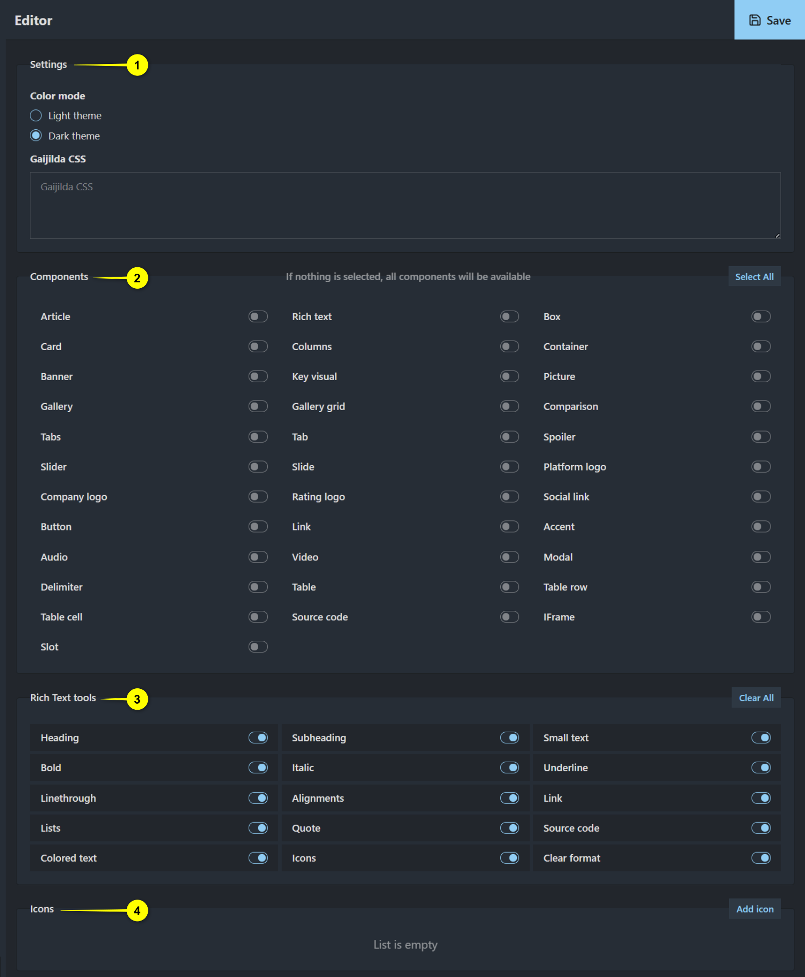
1 Settings: General appearance and behavior of the editor interface.
2 Components: Available layout and content blocks in the editor.
3 Rich Text tools: Inline formatting options for text-based components.
4 Icons: Custom icon list used within text fields and components.
Settings
Configure the editor’s general behavior and appearance.
Color mode: Choose between Light theme and Dark theme for the content editor UI. This setting affects the interface theme used by editors when composing content.
Gaijilda CSS: Optional. Custom CSS that can be injected into the editor preview. This is typically used to simulate the actual layout and design of a live site, ensuring that content appears in the editor as it would in production.
Components
Toggle which content components are available for use in the editor. If no components are selected, all components will be available by default.
Common component types include:
Article: Basic block for structured content.
Card: Modular, card-style content presentation.
Banner: Large visual component, often used at the top of a page.
Gallery / Gallery grid: Used to display a series of images in grid or carousel layout.
Tabs / Tab / Slide / Slider: Interactive tabbed and slide-based layouts.
Company logo / Rating logo / Platform logo: Brand or rating-specific visuals.
Button / Link / Social link: Interactive navigation elements.
Audio / Video: Embed multimedia content.
Table / Table cell / Table row: Structured data display.
Source code / Delimiter / Slot / Container / Box: Layout and developer-focused blocks.
Picture / Key visual / Comparison / Modal / IFrame: Visual enhancements or embedded content.
Accent / Spoiler: Stylized or collapsible content blocks.
Rich text: A flexible text content area with formatting support; used as a base inside many components.
Columns: Splits content into side-by-side vertical sections; useful for responsive, multi-column layouts.
Use Select All or Clear All to quickly toggle the entire list.
Rich Text Tools
Controls which inline editing tools are available in Rich text fields inside components. These tools allow fine-grained formatting inside text blocks.
Heading / Subheading / Small text: Text hierarchy options.
Bold / Italic / Underline / Linethrough / Colored text: Text emphasis and color styling.
Alignments / Lists / Quote: Structural and typographic formatting.
Icons: Insert visual icons inline.
Link / Source code / Clear format: Hyperlink support, raw code input, and formatting reset.
Use Clear All to disable all rich text tools at once.
Icons
A custom icon list can be configured for use in text and component fields that support inline icons.
Currently, the list is empty. Use the Add icon button to include new entries.

Uploaded icons can then be inserted via the Icons tool in the rich text editor.
Theme
Note
Documentation for this section is coming soon.
Meta Schema
Note
Documentation for this section is coming soon.
Components
Note
Documentation for this section is coming soon.
Webhooks
Note
Documentation for this section is coming soon.